A DESIGN SYSTEM IN THREE ACTS
Six years installing consistency in a platform that had been built one request at a time
- Role:
- UX Designer, then UX/UI Designer, then Product Designer. Sole designer on the platform
- Company:
- Intelisys, a ScanSource company
- Sector:
- B2B SaaS, telecom services distribution
- Dates:
- 2020 to 2026
PROLOG
No guiding rules underneath any of it. The interface was functionality driven, built one request at a time, each page shaped by whatever business logic sat behind it. The user was not really in the equation.
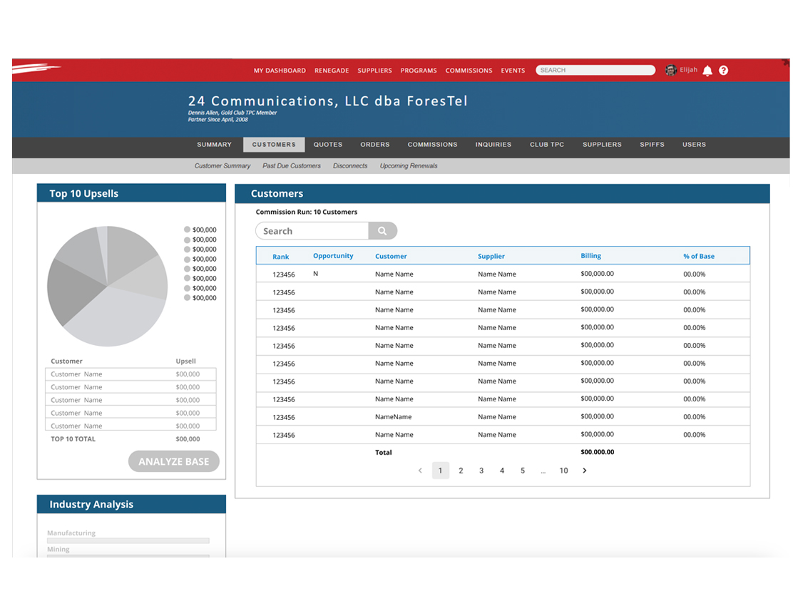
Roughly twelve heading values. Icons everywhere, most of them unclear. The button hierarchy unclear too. Inconsistent components, and no library to be inconsistent against. Every page bespoke. Bad navigation and poor wayfinding.
A design system was a nice to have, not a necessary, and it showed. There was never a design system project. Not in six years. Everything below happened inside work funded to do something else.
ACT I: RATIONALIZATION
2020 to 2022. Giving the interface rules it could be held to.
Nothing was wrong locally. Nothing held together globally, and there was no vocabulary to argue with.
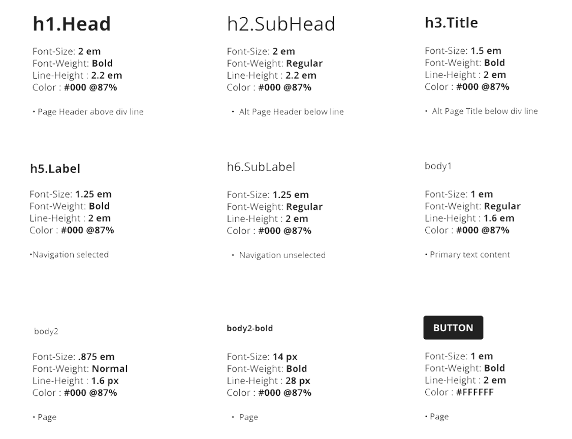
I cut roughly twelve heading values to six, removed semibold, then reintroduced it as a device for visual priority rather than emphasis by habit. I established fundamental rules for button behavior and hierarchy. I pruned the information architecture on top and side navigation and moved to a persistent left-hand nav. I set a spacing standard and built page templates. I took the real column count and gutter width from engineering and built Figma to snap to the production grid, so a mockup and a build described the same page.
Then a color collision. The action color was the brand color, so take action and something is wrong read the same, and on badges that was an accessibility failure. The brand color was fixed, so I took color out of the job: removed the orange, moved the interface toward black and white, and put the signalling on typeface and weight, text decoration, established icons used sparingly, and reversed type on primary buttons and the header nav.
When Intelisys aligned with the ScanSource brand in 2022, the palette changed again. The Intelisys red was less accessible than the ScanSource red, so we adopted ScanSource's. Red was the action color, which made links red, and red alone was not a strong enough signal to pick a link out of a paragraph. The standard fix, a blue link, broke both the brand and the design system code and would have turned the site red, white, and blue. The palette also followed a 60/30/10 split that works on a marketing page and fails on a screen of tables and forms. Colors had drifted between two codebases, the React pages and the older ones, and nothing said what a color meant.
So I gave every color a meaning before a shade, using Daniel Rosenberg's Semantic Interaction Design, which reads an interface the way you read a sentence. Noun colors identify the objects and data a partner works with. Verb colors mark what you can do, and appear only on interactive elements. Adjective colors describe state: success, warning, past due. Every color got rules by component and by state. That is what we would now call semantic tokens, and it is where the token strategy in Act III started.
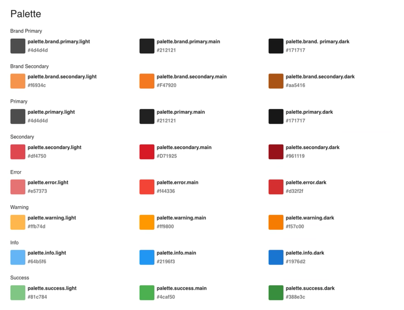
From that grammar, black became structural, with a black footer and inverse text on dark surfaces. The workspace moved to a grey paper background. The legacy red came out of rollover states. Links stayed red and were underlined, so color was never the only signal. The underline also did the job a rollover used to do, which mattered on touch screens, where there is no hover. That made it the compromise between stakeholders who wanted the site mobile first and those who wanted it for desktop only: one link pattern that worked on both. The gold and silver partner badges needed colors the brand guide did not have, so I chose them outside the guide and tested them against WCAG. Everything was checked in dark mode and for color vision deficiency. Marketing pushed back, since their training screenshots would need redoing. I held the line that usability depends on how the product works, not only how it looks, and the change went through.
Produced: a type scale, button rules, a color system whose meaning is carried by more than color, a semantic color grammar with rules by component and state, partner badges that pass WCAG, a navigation structure and a reversed header, a spacing standard, page templates, and a grid that matched production.
ACT II: GOVERNANCE
2020 to 2026. Getting it adopted with nothing to fund it.
No dedicated design system project, ever, and a one and done view that made revisiting shipped work expensive to request. Then around 2022 React and Material Design arrived, bringing a component library where there had been none, workable and carrying so many edge cases it bordered on incoherent. Components were now available faster than decisions could be made about them, and developers pulled them in directly. The components are well vetted. The problem was that nothing was being decided, so nothing was left behind for the next person.
I ran a full platform inventory with the product manager, catalogued every inconsistency, and built a prioritized roadmap of small contained projects. Make every hyperlink one color. Settle how a button behaves. I took the catalogue to engineering, so sequencing became a shared conversation rather than a designer's wish list. I used analytics to set order, converting the highest traffic pages first and sunsetting pages nobody used. That order was set for the team's delivery, and it landed the system's visual and functional consistency on the pages carrying the most use.
I documented how components were used. Nobody was writing that down, so a component adopted once and a component the product depended on looked identical from the outside.
I broke the quote tool's pages-long forms into stepped sections. Dividing a long task means deciding what a division looks like, where the user is told they are, and what moving between them does. Those answers became the stepper, and it became the pattern for long forms across the site.
I brought engineering into lo-fi discovery. I used to design alone, show the team late, and get sent back to rebuild around whatever was cheapest to code. Hearing their constraints while the design was still soft ended that. I asked QA to challenge my designs. What they turned up were not holes in the design but holes in the logic, behavior questions that had never made it into the ticket. Those started getting captured.
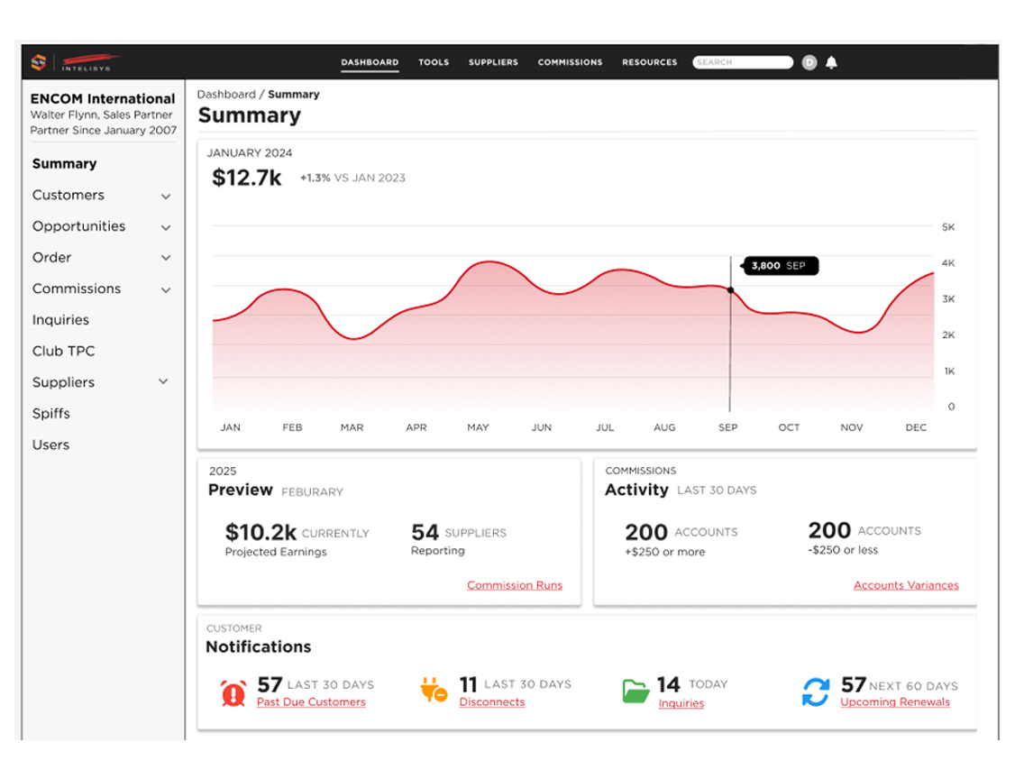
The dashboard was the largest single application of the work. It had been a flat table of numbers, and it became a card-based layout with graphs, built entirely from the rationalized type scale, the button rules, the spacing standard, and the component library. If you want to see what the system did, that is the page to look at.
Produced: a backlog that kept the unbuilt work visible instead of forgotten. A written account of how components were actually used. A design process with engineering and QA inside it rather than downstream. And the stepper, running across the site.
ACT III: INTEGRATION
2023 to 2026. Closing the distance between design and code.
The platform had three descriptions of itself and they disagreed: my HTML and CSS style guide, published online, my Figma component library, built with auto layout and instances, carrying colors, sizes and states, and engineering's React and Material components in Storybook. Design lived in Figma, production lived in React, and the gap between them filled with assumption.
I am not a developer. I read the production code in the browser inspector and built the Figma library from what was actually shipping rather than from what anyone believed was shipping. I gave the front-end developer the design when the dev manager introduced Storybook as a shared source of truth, and checked that every component and every state existed in both places. I prototyped in Figma Make seeded with the CSS from my own style guide, so generated output spoke the product's language instead of a generic one. I pushed for design tokens derived from React and Storybook: one vocabulary shared by the design tool and the codebase.
Produced: Storybook as a genuine crossover artifact, and a token strategy that was started and not finished. I was laid off a week after that work began.
EPILOGUE
True of any living design system, it was a work in progress. It has to keep moving, and its themes have to hold while it does. It was considerably better than what I walked into. I am proud of that.
My battle cry was consistency is not a visual preference. It is what a product has to have to make sense and deliver value, and it works by being predictable, so a user always knows what is going on, what is important, and what to do next. Perfection was always the enemy of the good. Usability beats absolute consistency, and knowing when to break the pattern is the job.