SIX YEARS, SERVED ON SMALL PLATES.
Six short projects from Intelisys, each on the same plate: the problem, the approach, the result, and a question worth asking me.
- Role:
- UX Designer to Product Designer
- Company:
- Intelisys, a ScanSource company
- Sector:
- B2B SaaS, telecom services distribution
- Dates:
- 2020 to 2026
A DASHBOARD THAT ANSWERS THREE QUESTIONS.
Year: 2024 to 2025 / Role: UX/UI Designer / Status: Shipped
THE PROBLEM
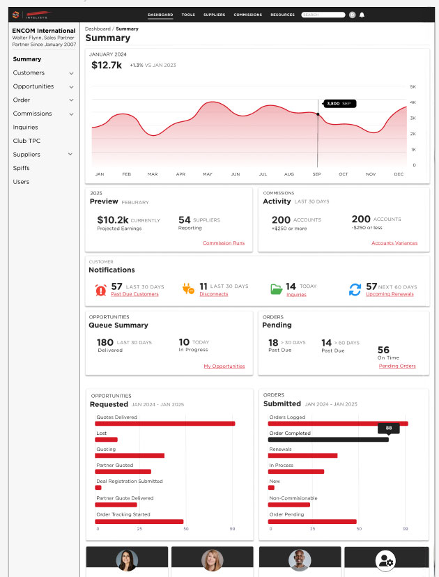
The partner dashboard was a flat table of numbers. It showed data but answered nothing, and the request on the table was a reskin.
THE APPROACH
Before designing, I researched which kind of dashboard partners needed. Strategic dashboards track long term goals. Operational dashboards run the day. Partners needed both, so I designed a tactical dashboard that bridges them: how the business is trending, and what to act on right now. Every section had to answer one of three questions: How am I doing? What is happening right now? What needs my attention?
- Commissions led the page.
- Summary, opportunity statistics, and orders became cards and graphs, and every graph links to the detail behind it.
- Side navigation follows the scroll, matching conventions already on the site.
- A new Opportunities section followed the Salesforce pattern partners already knew: an account, then its related orders. It was the opportunity driven task flow the persona research pointed to.
Everything was built from the design system.
THE RESULT
Shipped, and the largest single application of the design system.
“The layout and end result of the dashboard are truly award worthy.”
ASK THE CHEF
Why tactical, and not strategic or operational.
FLOWS
ONE LONG FORM, BROKEN INTO STEPS.
Year: 2023, extended through 2025 / Role: UX/UI Designer / Status: Shipped
THE PROBLEM
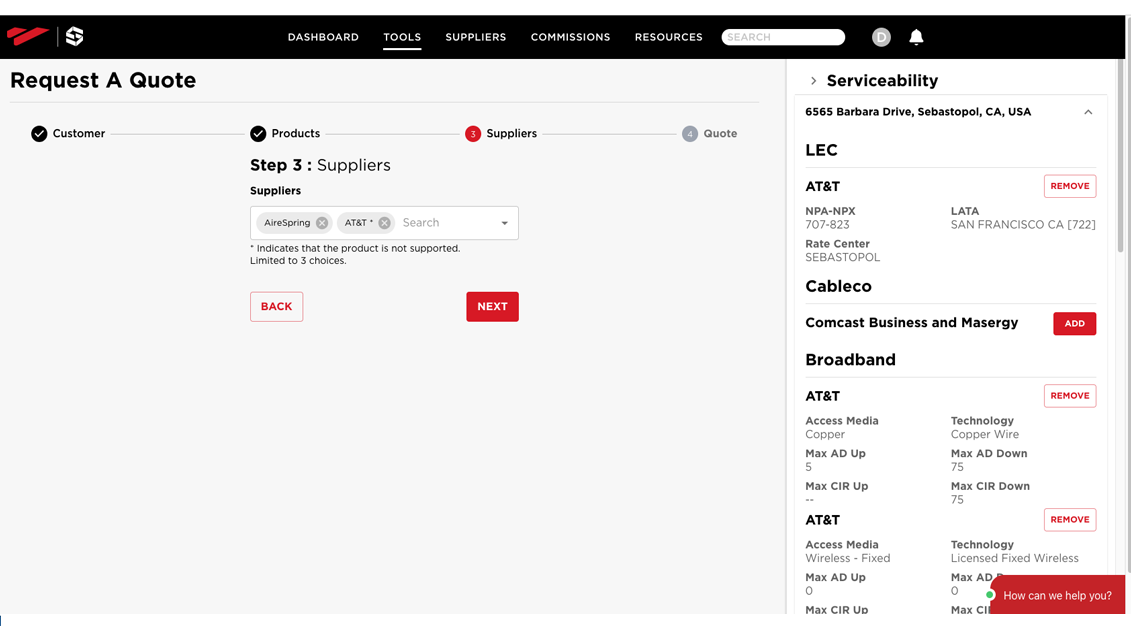
Request a Quote was a single long form. Partners scrolled through location, services, and supplier choices with no sense of progress, and no help picking the right supplier for an address.
THE APPROACH
Most of the work was form design: breaking the data into chunks a partner could finish one at a time.
- A stepper split the form into steps. It became the pattern for long forms across the site.
- A drawer to look. A slide out drawer showed metrics on the suppliers and services available at a location, so partners could compare while building the quote. A drawer, not a modal, because reference material should sit beside the task without blocking it.
- A modal to do. Partners asked for a way to enter many addresses at once. Bulk entry is a separate, focused task, so it got a modal.
- Submit an Order gained the same stepped pattern and a connection to the opportunity record, so quote data carried forward into the order.
THE RESULT
Shipped, built in React with Material UI.
“A highly useful, interactive, and functional tool.”
ASK THE CHEF
When to use a drawer, and when to use a modal.
FLOWS
A LOGIN PAGE HAS ONE JOB.
Year: 2025 / Role: UX/UI Designer / Status: Shipped
THE PROBLEM
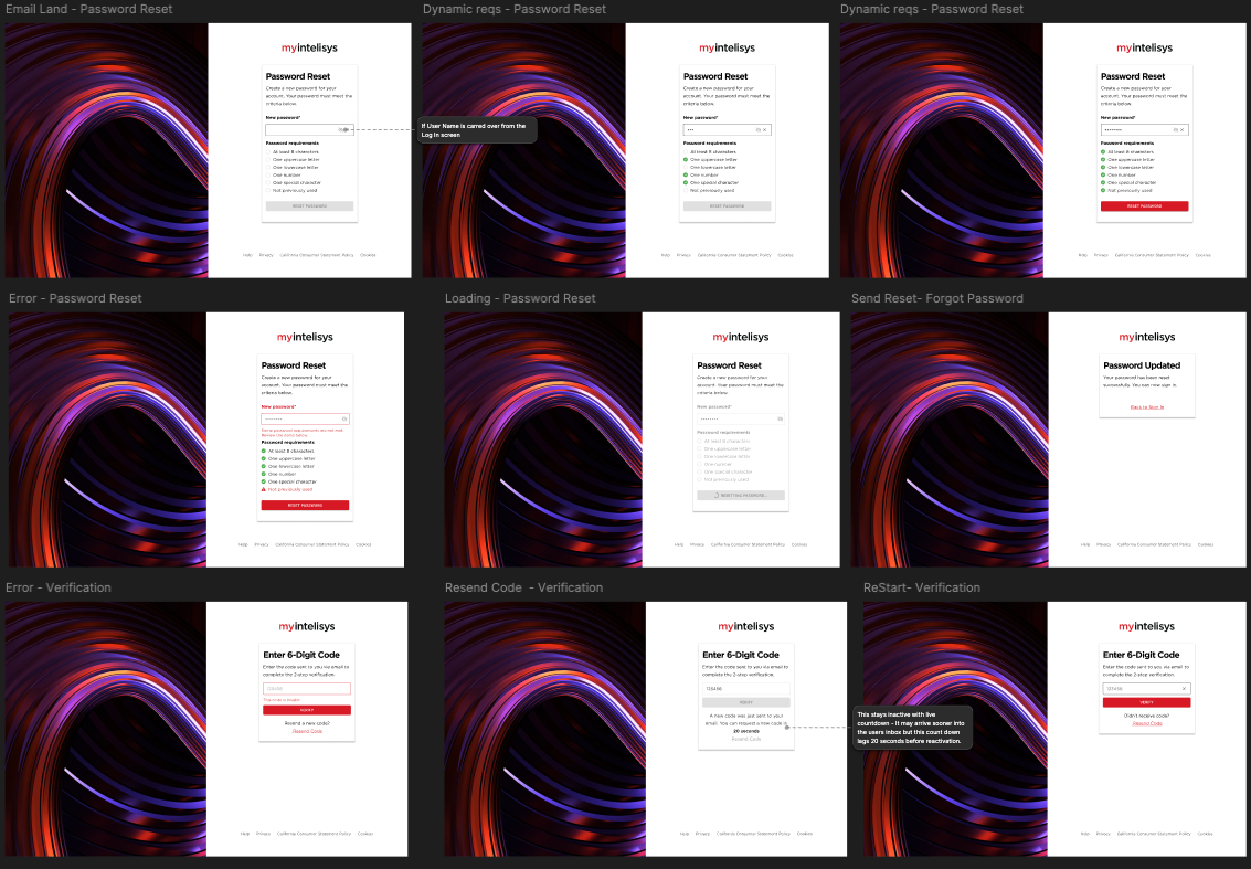
The login page was the front door to MyIntelisys, and it had become a billboard: rotating images, ads for tools and events, and links out to several landing pages. For a partner trying to sign in, it was busy and confusing. Sign up, privacy, and cookie information also lived inside MyIntelisys, mixing the product with the company's marketing. Behind the page, the old password validation no longer met security standards.
THE APPROACH
Login Page Modernization was one piece of a larger effort I drove: rebuilding the site page by page on the new design system and paying down tech debt as we went. Pages were prioritized by traffic and by back end complexity, and the login ranked high on both, with security added on top.
I argued that a login to a SaaS platform has one job, and that motion and promotion work against it. I researched login flow best practices to back the argument.
- I met with developers to understand the back end requirements behind the new verification method, and mapped the task flow from them.
- I worked through every state with developers, including errors and recovery, and built them into the design system.
- I rebuilt the forgot password flow, error states included.
- With legal, I updated the cookie policy and moved sign up and privacy information to the Intelisys website. MyIntelisys became the tool, and the marketing site did the marketing. Sign up now sends prospective partners there.
- I worked with marketing design to choose one image that fit.
THE RESULT
Shipped. The login does one thing, verification meets current security standards, and marketing traffic goes to the site built for it. The page became the model for modernizing the rest of the site.
ASK THE CHEF
How you convinced marketing to give up the carousel.
DESIGN SYSTEM
ONE SET OF RULES FOR EVERY TABLE.
Year: 2026 / Role: UX/UI Designer, sole designer on the platform / Status: Shipped
THE PROBLEM
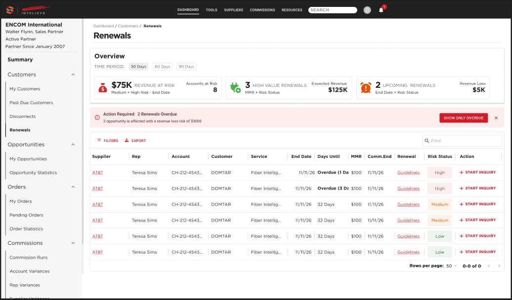
MyIntelisys ran on tables, and every table ordered its columns differently. An outside UX evaluation flagged the tables as hard to scan and act on. On My Orders the problem was concrete: partners needed Commission Status to know which orders were past due, and on smaller screens it scrolled out of view.
THE APPROACH
I set one left to right order for every table: identifier, descriptors, metrics, dates, status, actions.
The hard question was status. The rule we landed on: a status is placed by what it does, not what it is called. Order Status helps you recognize the row, so it sits left with the identifier. Commission Status triggers the page's main action, so it stays right and is pinned.
- Critical columns never hide or truncate.
- Important columns can truncate, with a tooltip.
- Secondary columns collapse first.
- Visibility problems are solved by pinning and collapsing, never by reordering.
I gave developers a configuration model where each column declares its type, priority, pin, and truncation, then worked with the front end developer to carry the rules from the Figma library into Storybook.
THE RESULT
Shipped, and completed on schedule. Every table on the React pages follows the standard, with Storybook as the source of truth for production. A few legacy pages outside React kept their old tables.
ASK THE CHEF
Why one status column sits left and the other is pinned right.
Part of A Design System in Three Acts.
AI
THE BOT WAS NEVER THE PROBLEM.
Year: 2025 / Role: UX/UI Designer / Status: Explored, then shelved
THE PROBLEM
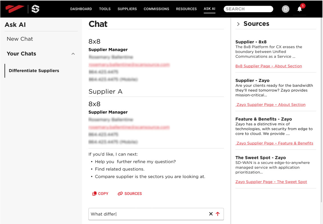
The company was negotiating with a contractor for an AI chatbot. The assumption was that partners needed a bot to teach them how to use the site.
THE APPROACH
Discovery pointed somewhere else. Partners did not need a tutor. They needed to find things fast, whether that was a support phone number or the steps to create an order. The failure was search, and underneath it the information architecture. I showed that search augmented with AI, built into the way partners already looked for things, would serve them better than another tool on the site.
In my process, I use AI as a sparring partner, not a layout machine.
- On Contract Builder, I gave Gemini the real problem, up to 90 promotions per configuration and a pricing summary that had to update live, and had it argue accordion versus modal.
- On tables, I used GPT and Claude to turn a long decision thread into a standard, with a summary ready for a Jira ticket and a configuration model developers could build from.
THE RESULT
The findings moved the project from adding a tool to fixing how partners find what they need, a problem that reached into the site's structure. The bot was shelved.
ASK THE CHEF
What the company assumed the bot was for, and what partners actually needed.
Same principle as Build It Into the Flow, Not Beside It.
PROCESS
DECISIONS MADE EARLY, WHERE THEY ARE CHEAP.
Year: 2023 to 2026 / Role: UX/UI Designer / Status: Adopted
THE PROBLEM
Development priorities, like mobile first, surfaced after designs were done and arrived as last minute changes. Design requests were being validated by opinion. And tickets often did not match the designs they described.
THE APPROACH
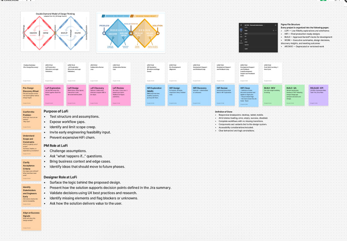
I built the process in layers, over three years.
- 2023: Developers joined at low fidelity, so their priorities were designed in instead of patched in.
- 2025: SME interviews became part of discovery. They surfaced real pain points and the value a tool actually delivered. We named our assumptions, tested the ones that mattered, and dropped the rest.
- 2026: I met with QA and the front end developers and found the designs and Jira tickets were not aligned. With a new PM we added user stories and a record of our assumptions to every ticket.
I defined the design workflow, and the product lead built it into Jira. Throughout, I previewed work in progress with developers before it merged, fixing small UI issues and setting style guide rules as we went.
THE RESULT
Changes moved into the design phase, where they were cheap. Opinion came out of prioritization. I taught the process to a new PM, a UX intern, and a CX colleague.
“A library of UX knowledge.”
ASK THE CHEF
How SME interviews changed which projects got built.